Final Expense - Quote & Checkout Tools
Final Expense - Quote & Checkout Tools
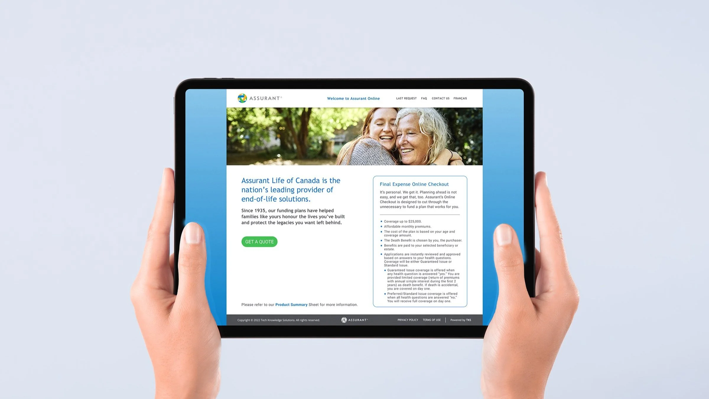
With the recent global pandemic, many realized they were not prepared when it came to final expenses. During this time, the industry saw a growing trend of people interested in pre-planning for Final Expenses. Assurant felt it was the right time to bring their Quote Tool pilot project to production.
Discovery
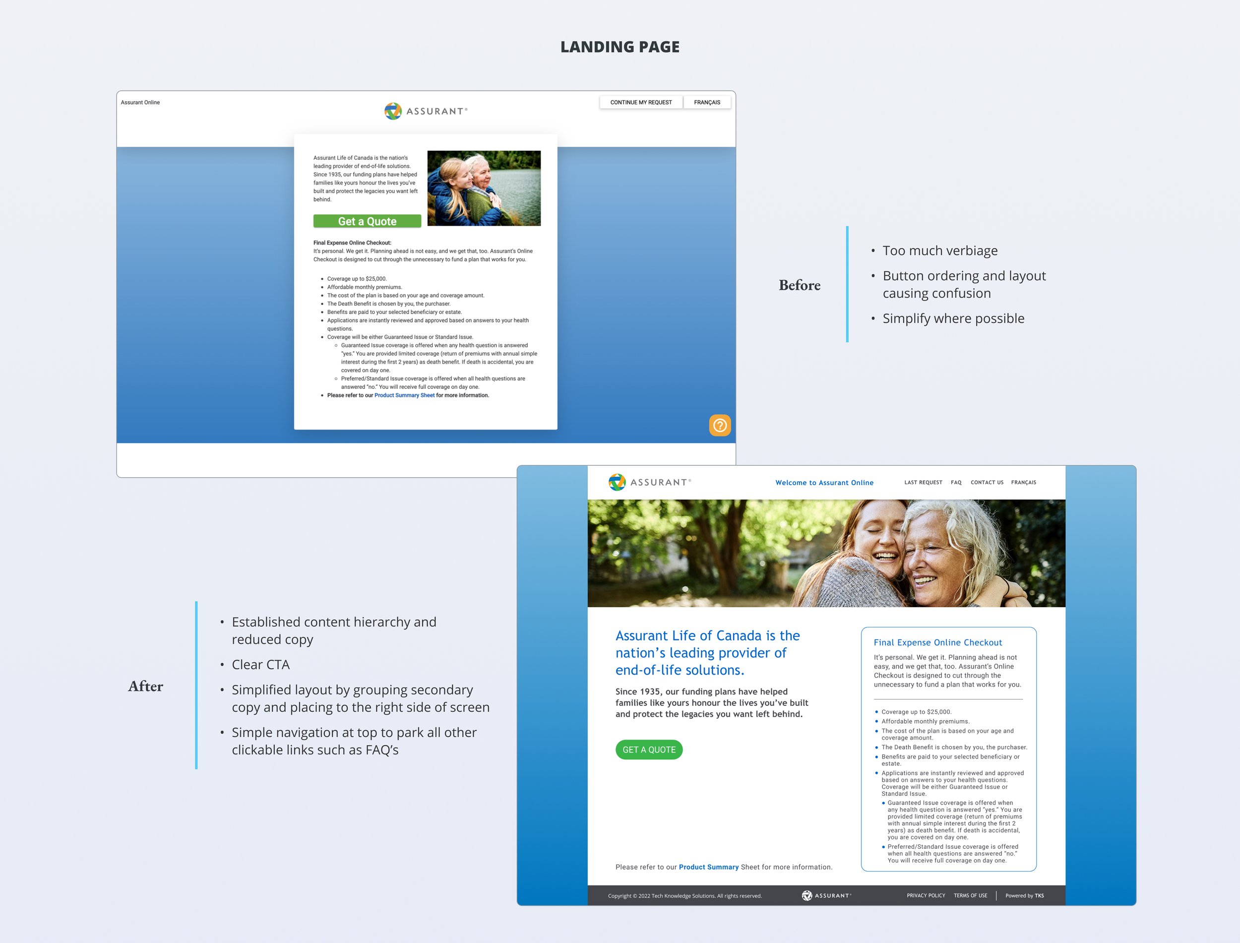
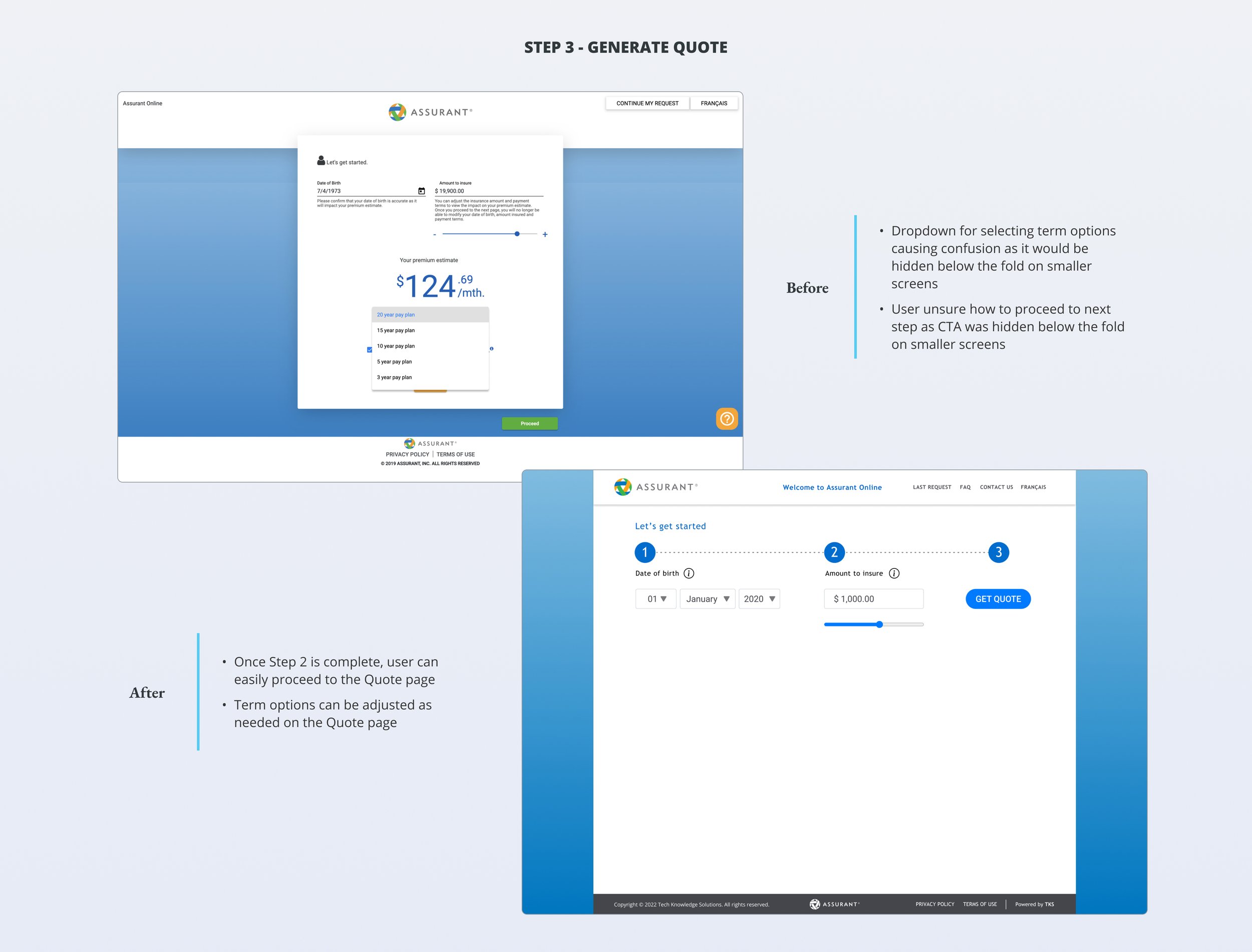
The original pilot site was limited as it was developed on a site creator platform that was not capable of responsive design. Feedback from users stated there was too much copy and clutter, as well as navigating to next steps proved confusing. The next iteration of the site would be designed for a responsive web experience, while taking this opportunity to improve the user experience and polish the UI based on user feedback.
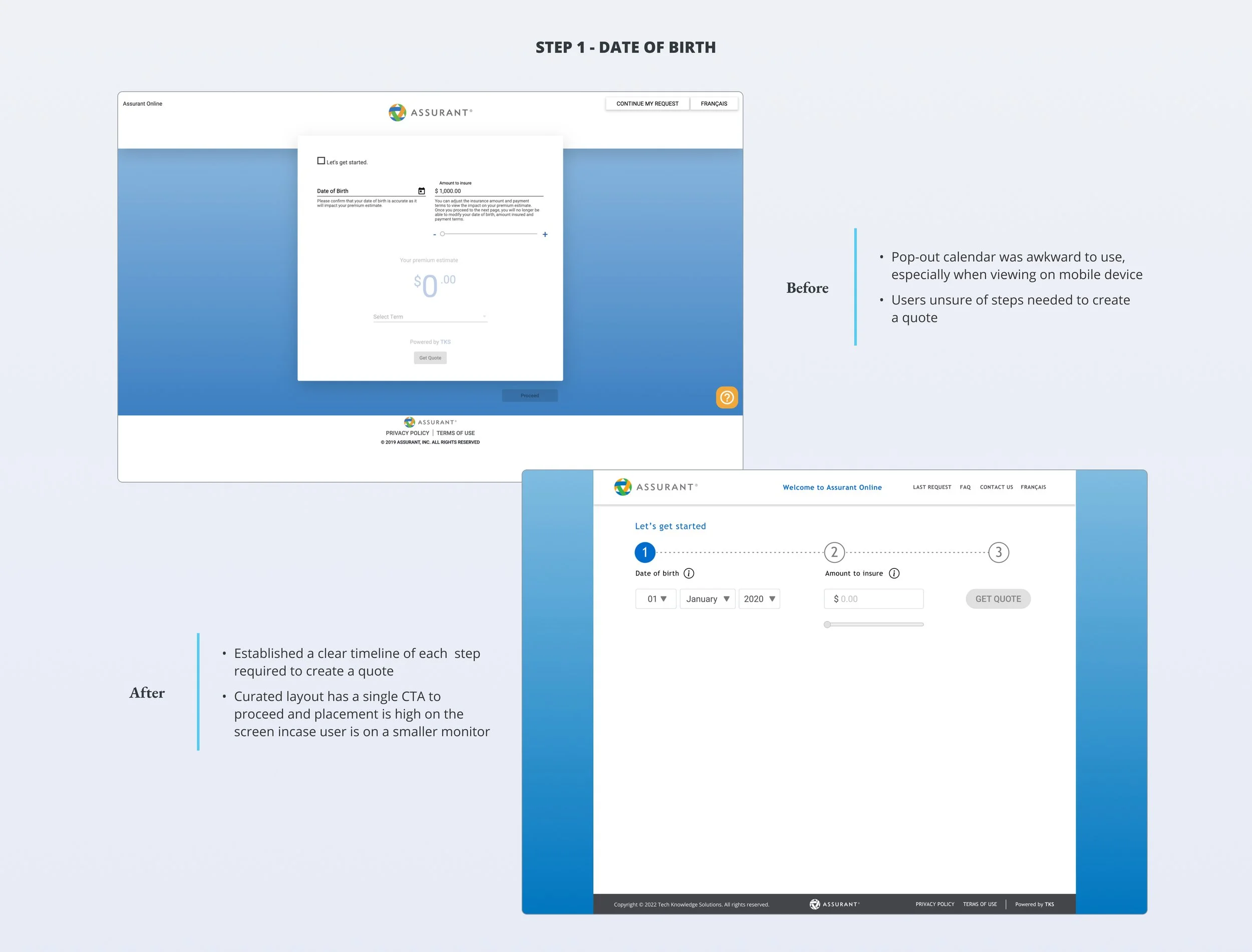
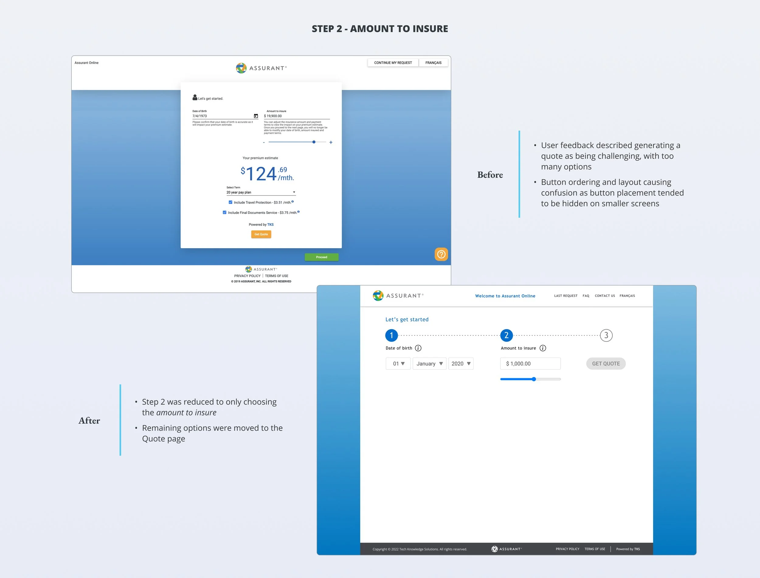
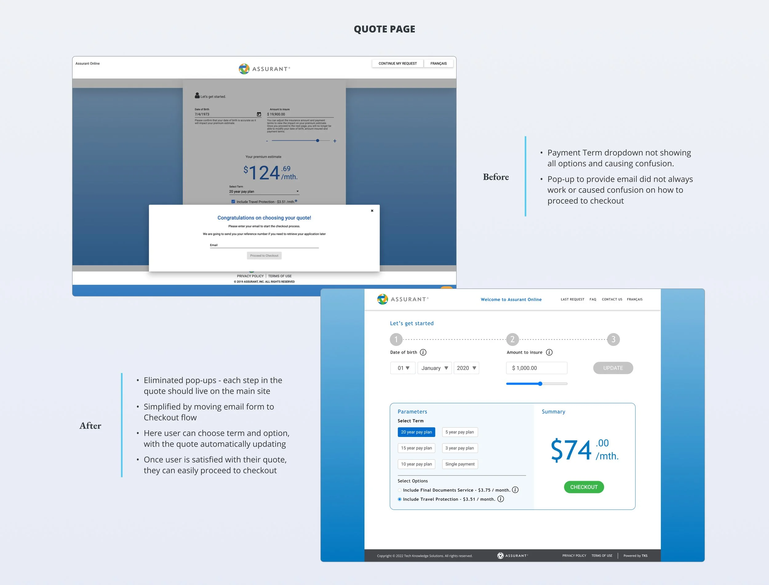
Comparison of Before and After
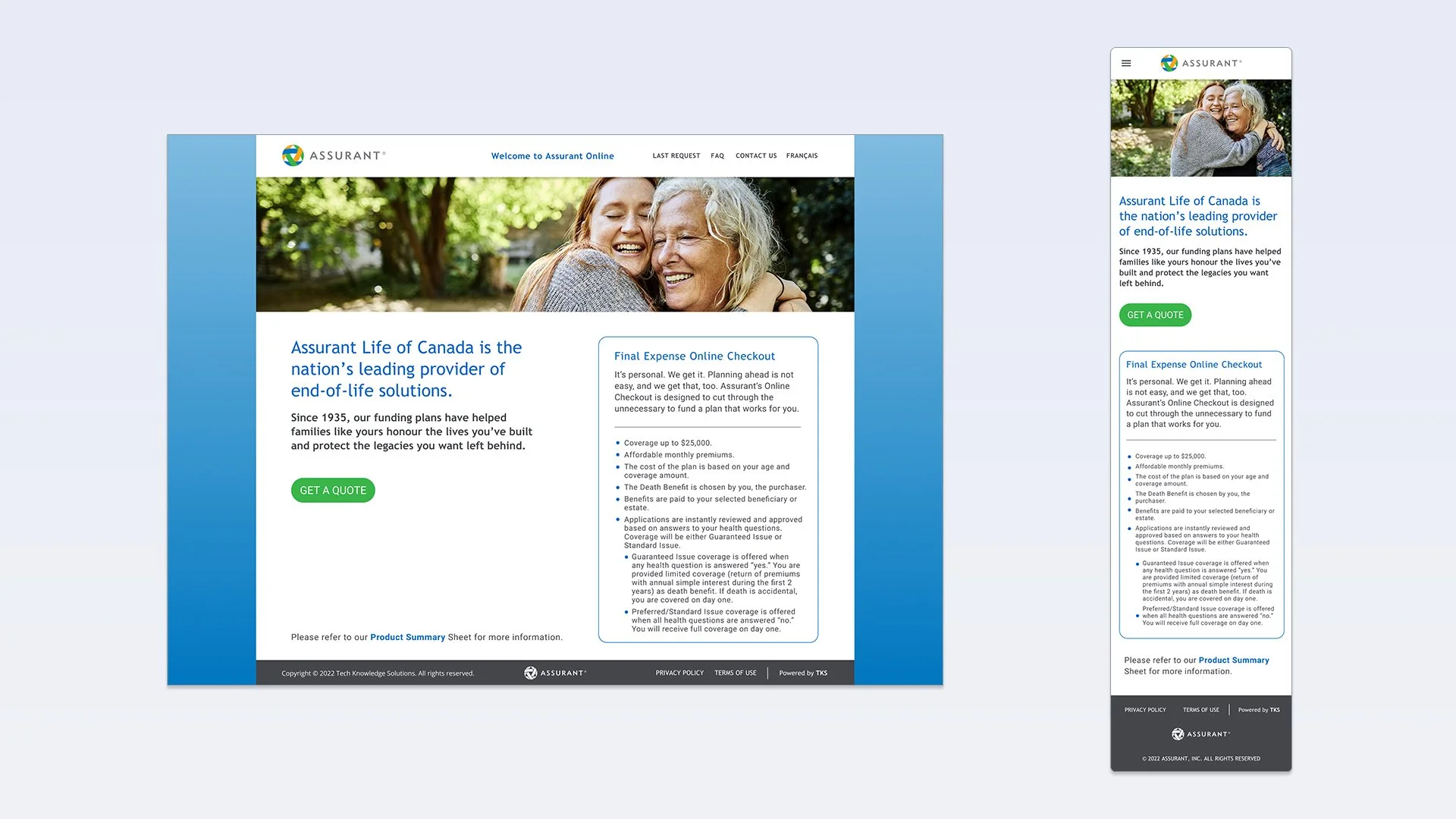
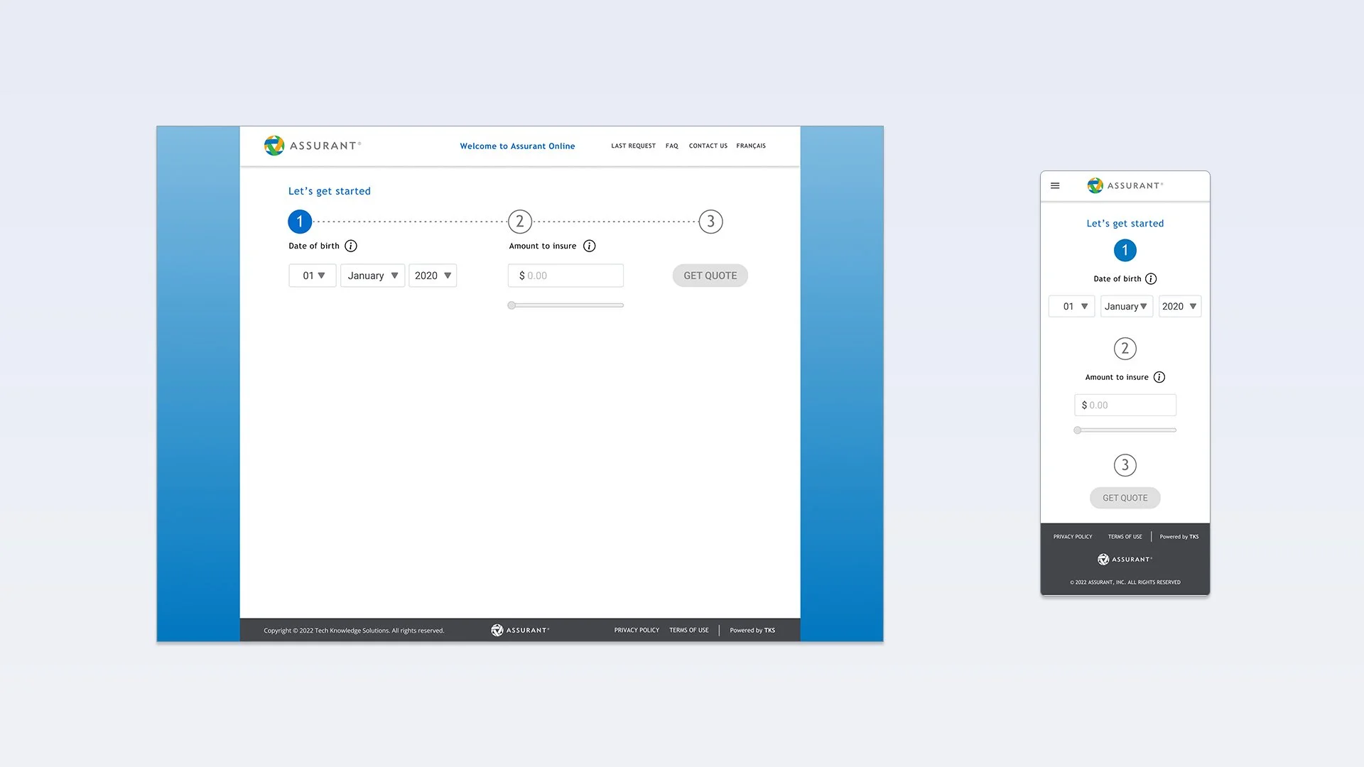
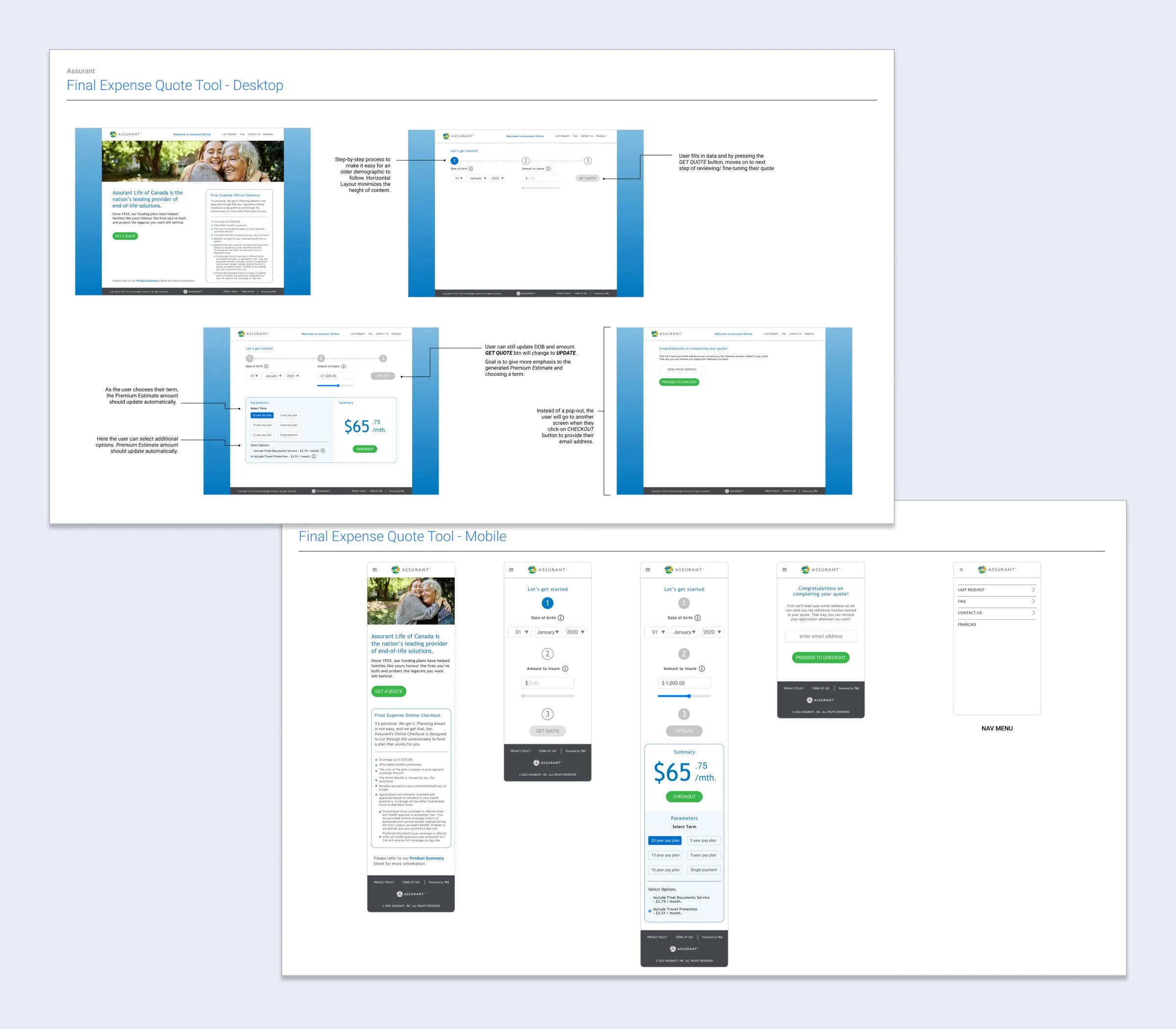
Desktop & Mobile Wires
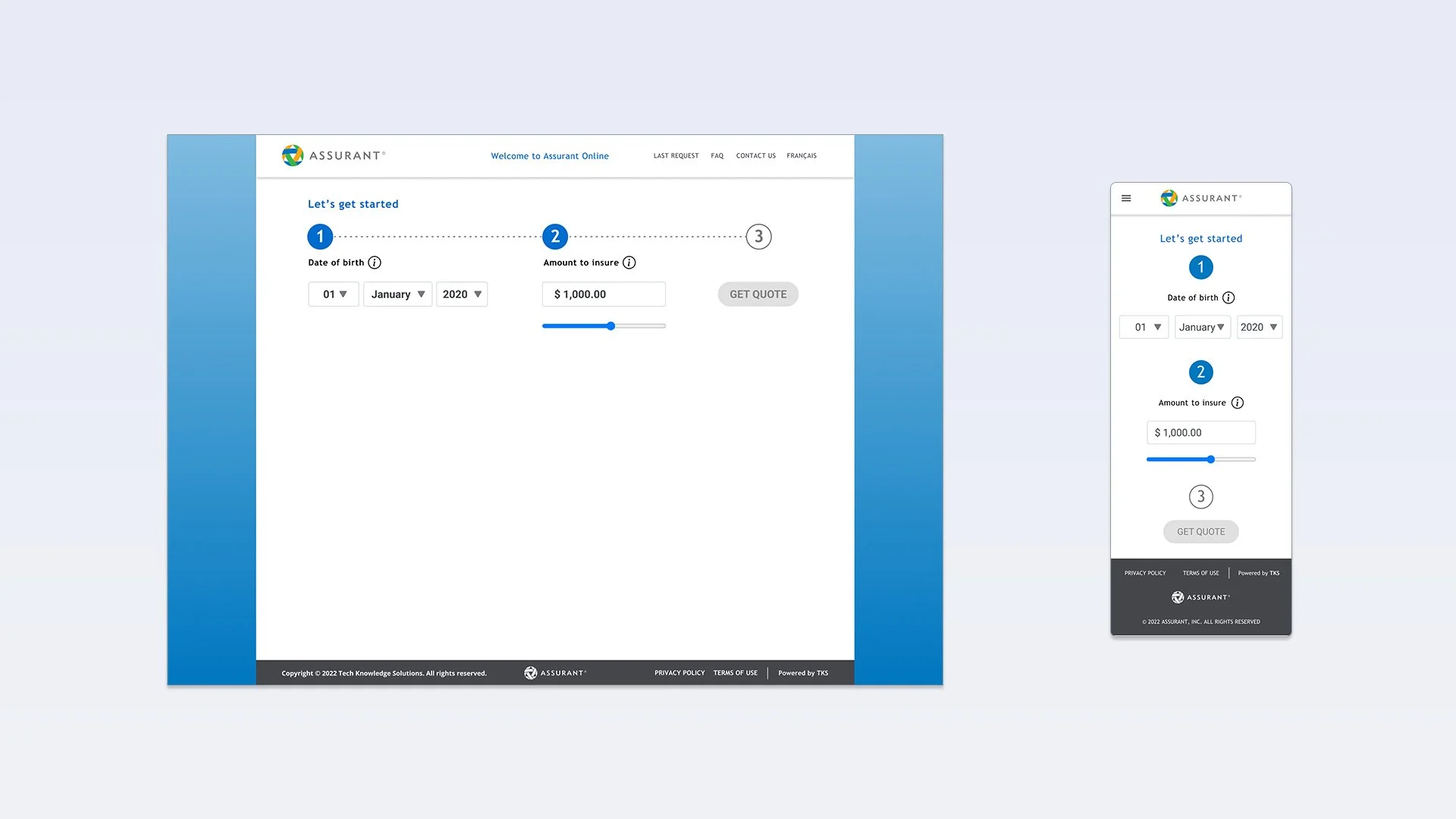
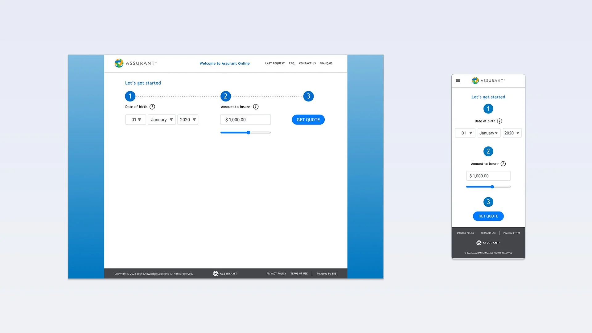
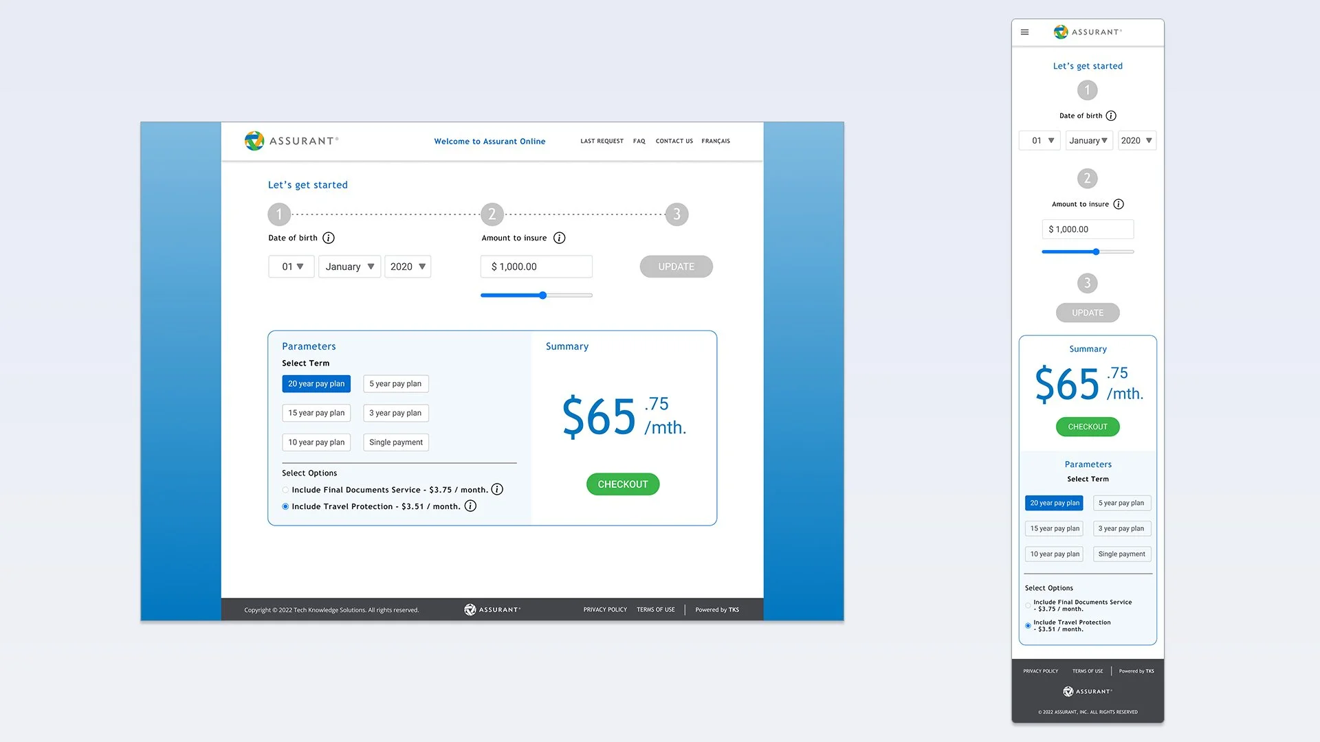
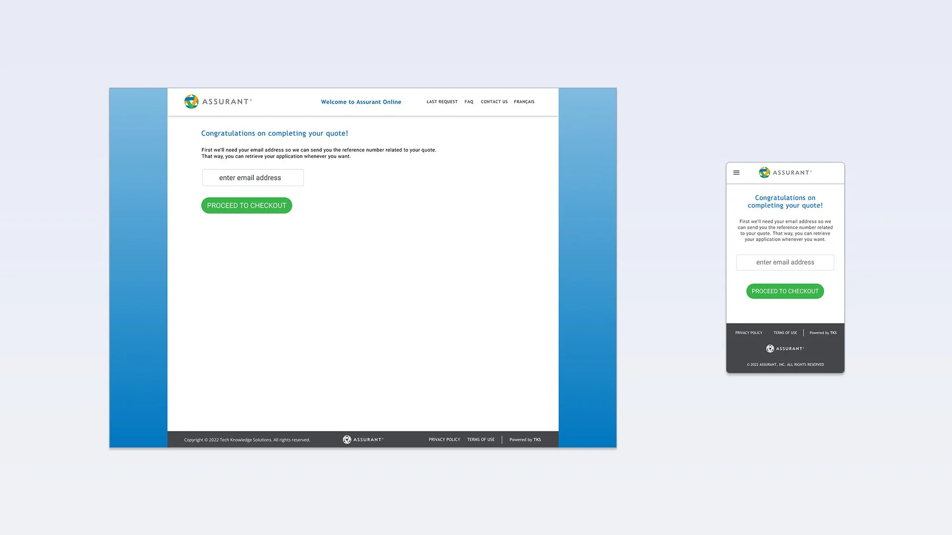
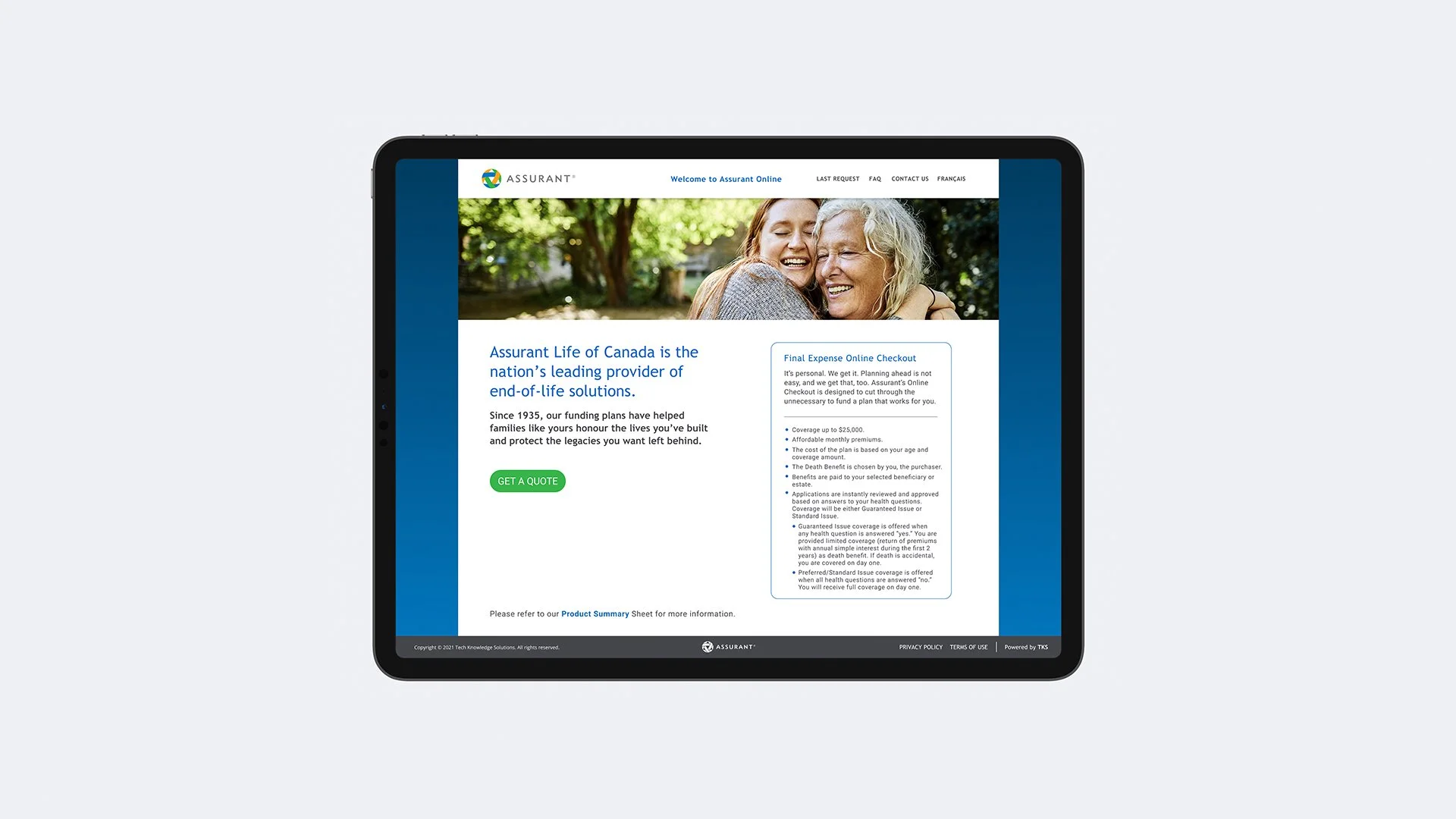
The initial pilot site revealed that the user experience was proving to be a challenge for older adults. To alleviate this, excessive copy on the landing page was reduced and a clear visual hierarchy was established to highlight the most important elements on the page. The flow for creating a quote was presented in a clear step-by-step process. The flow was more fluid as the user was never redirected to another page or interrupted by pop-up windows. For the Quote screen, we made it easier for the user to choose a Term period & available options, which once chosen would then automatically update the quote amount.
Prototype
Checkout
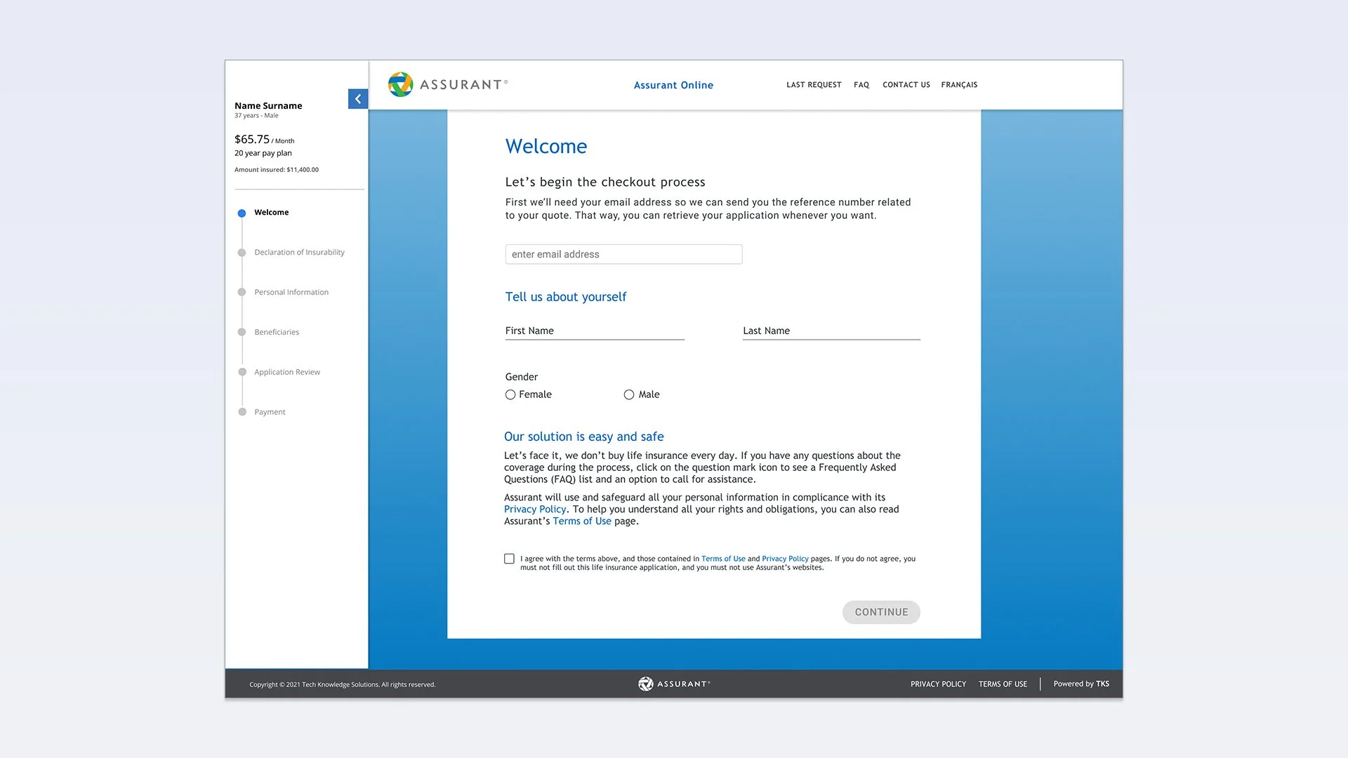
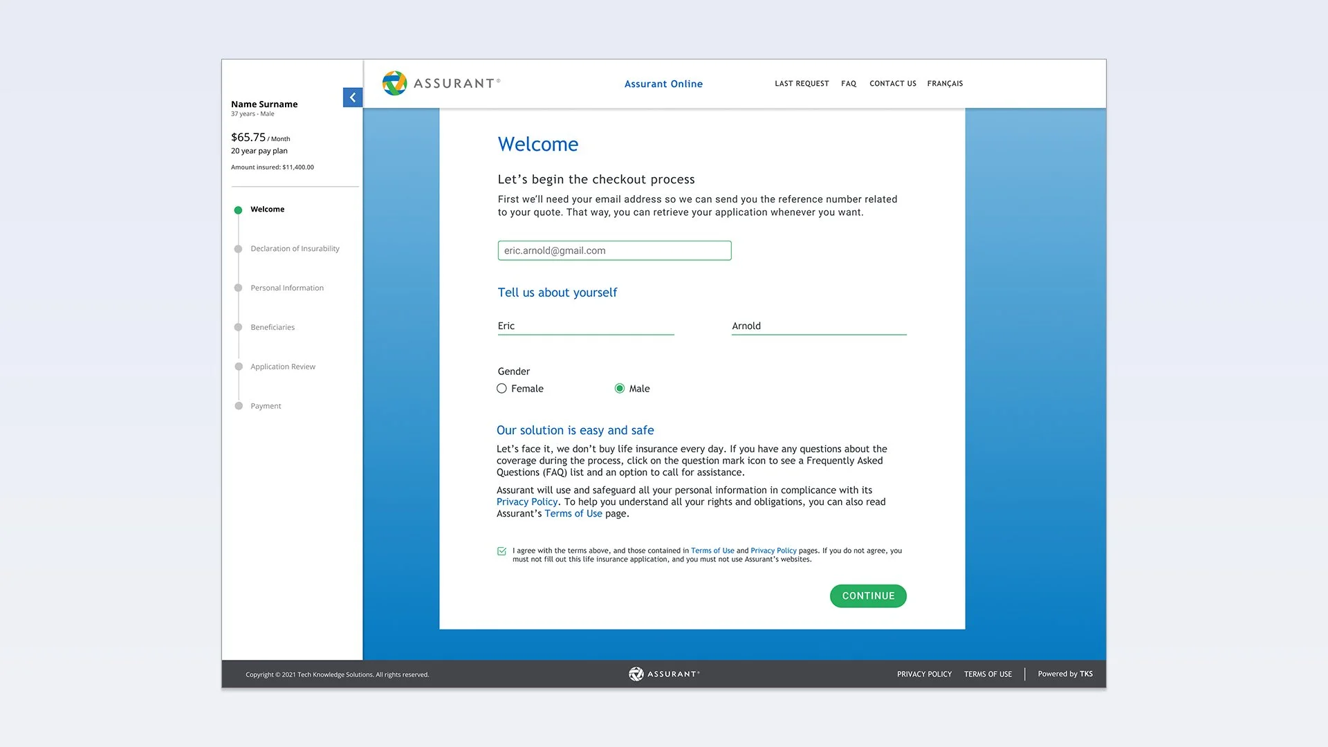
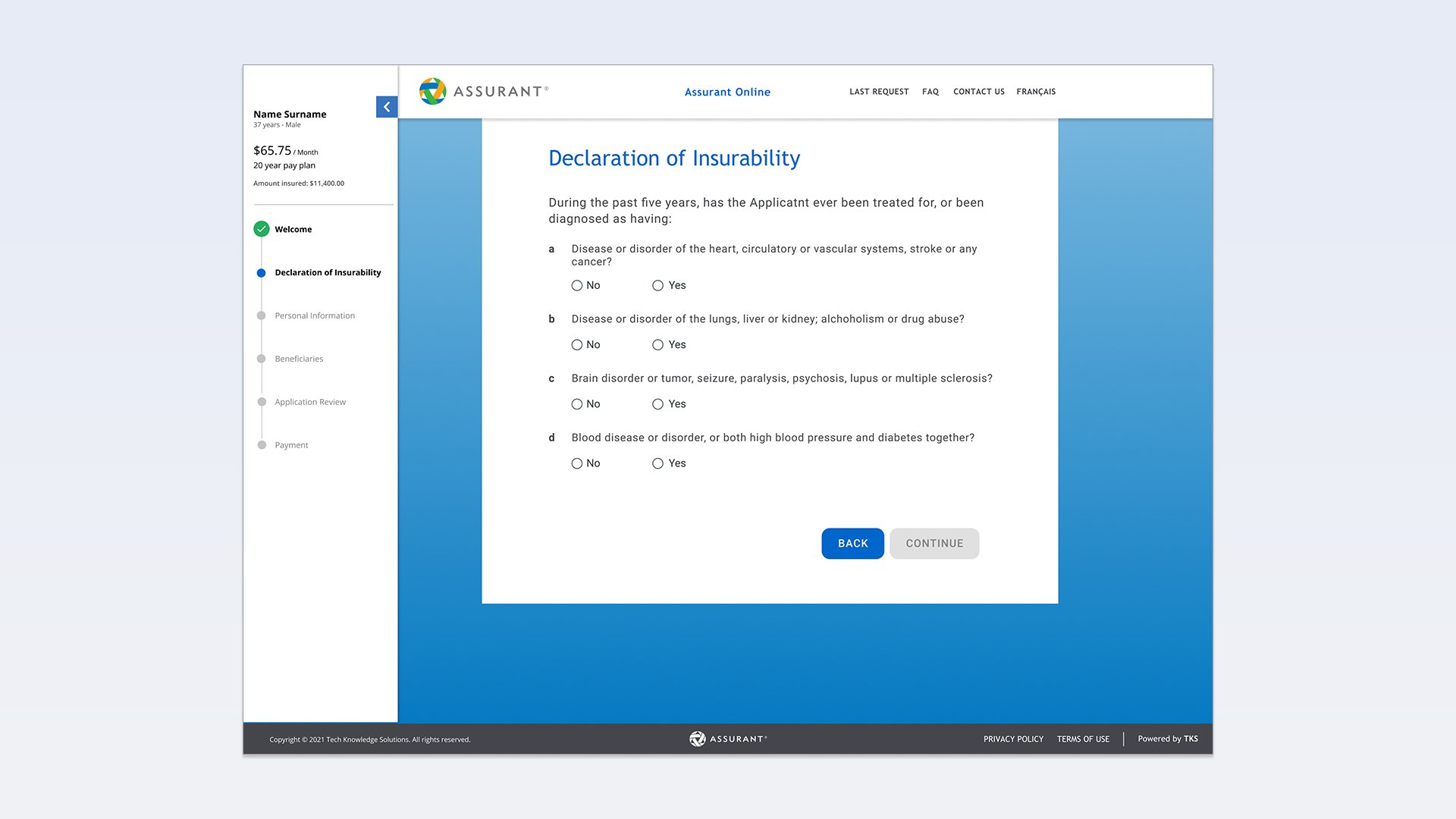
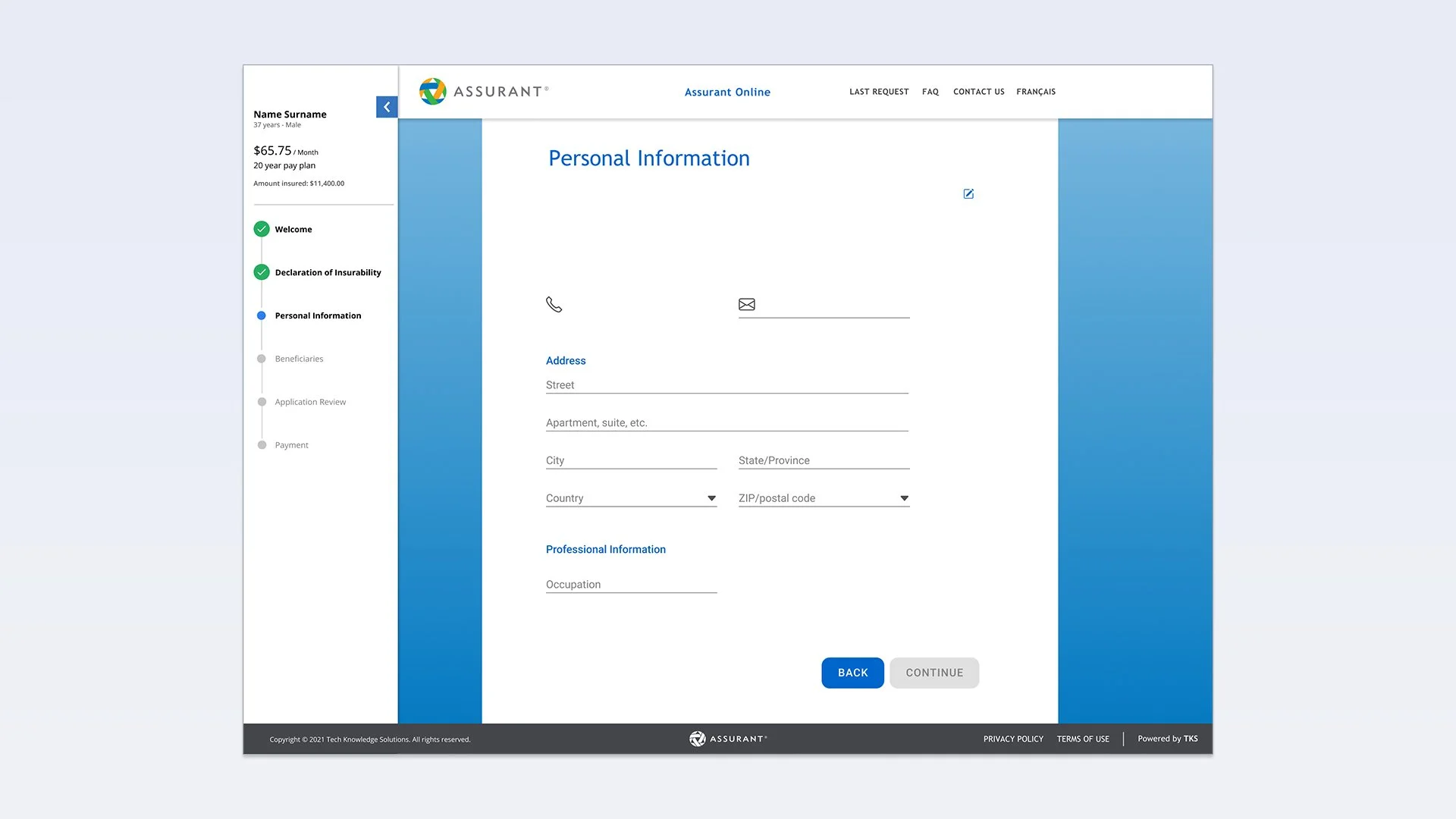
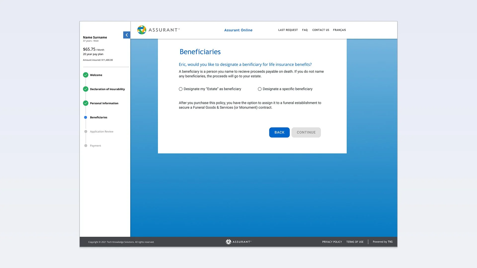
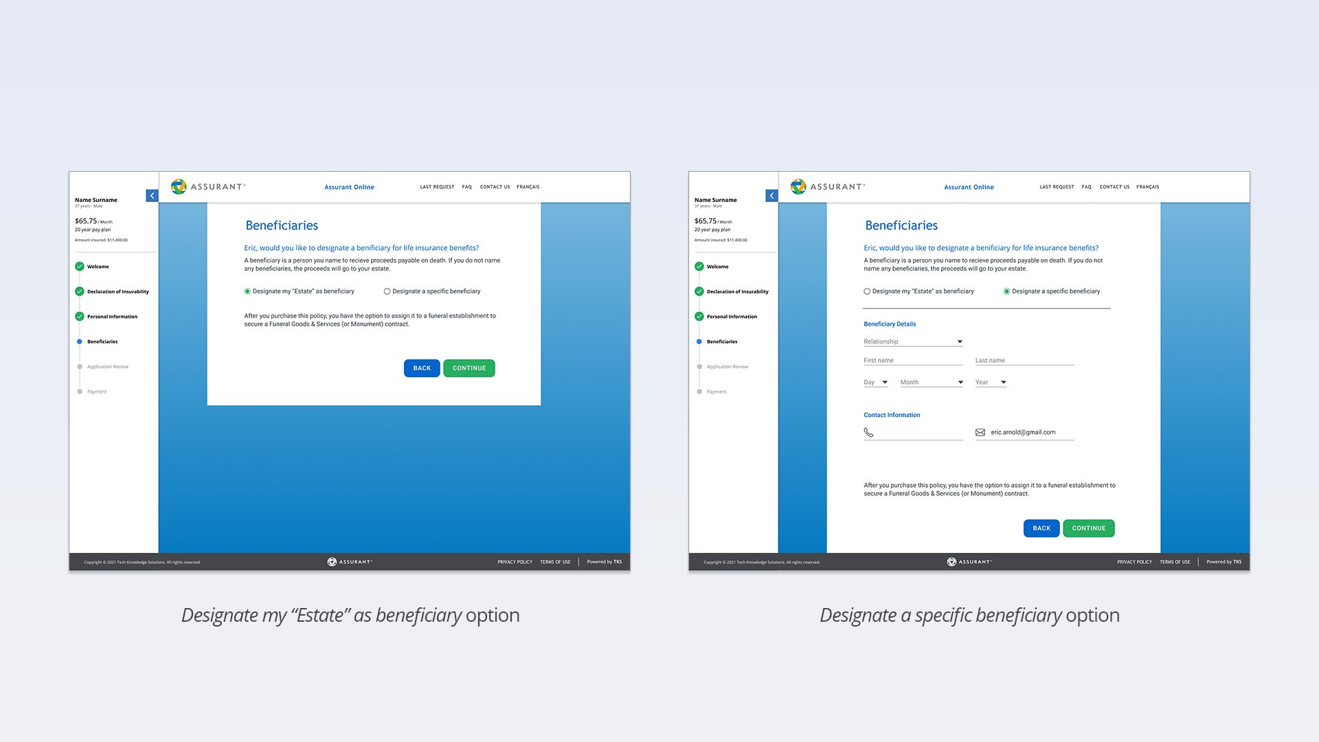
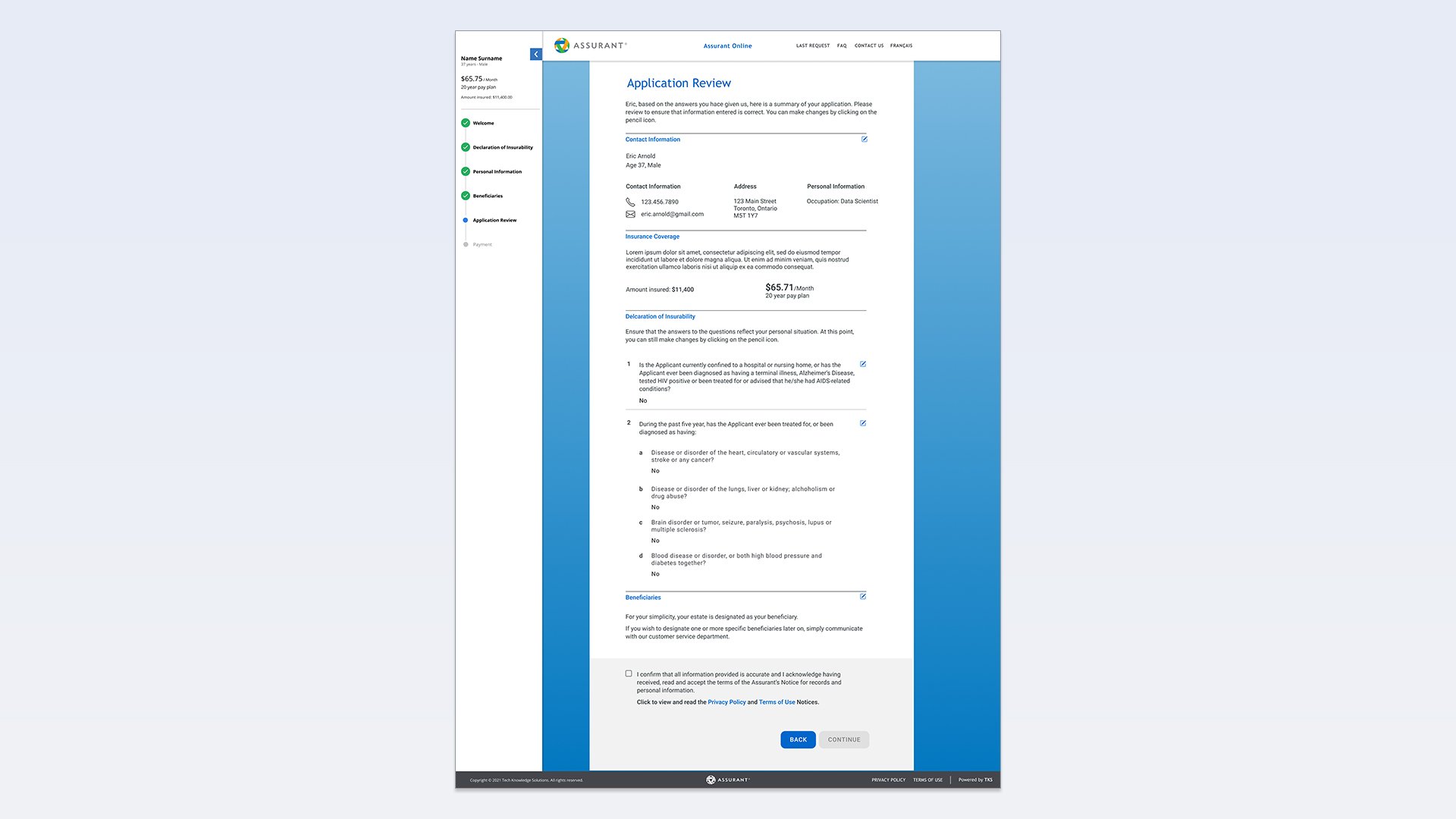
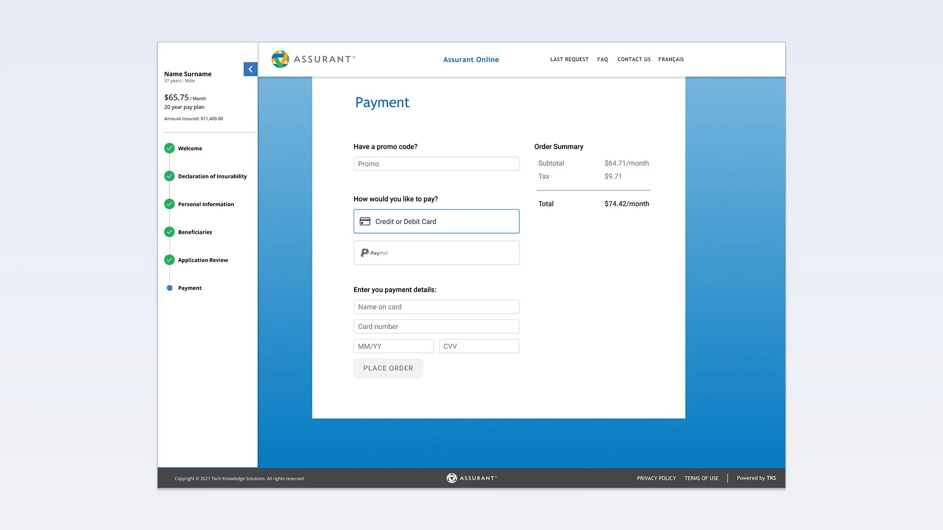
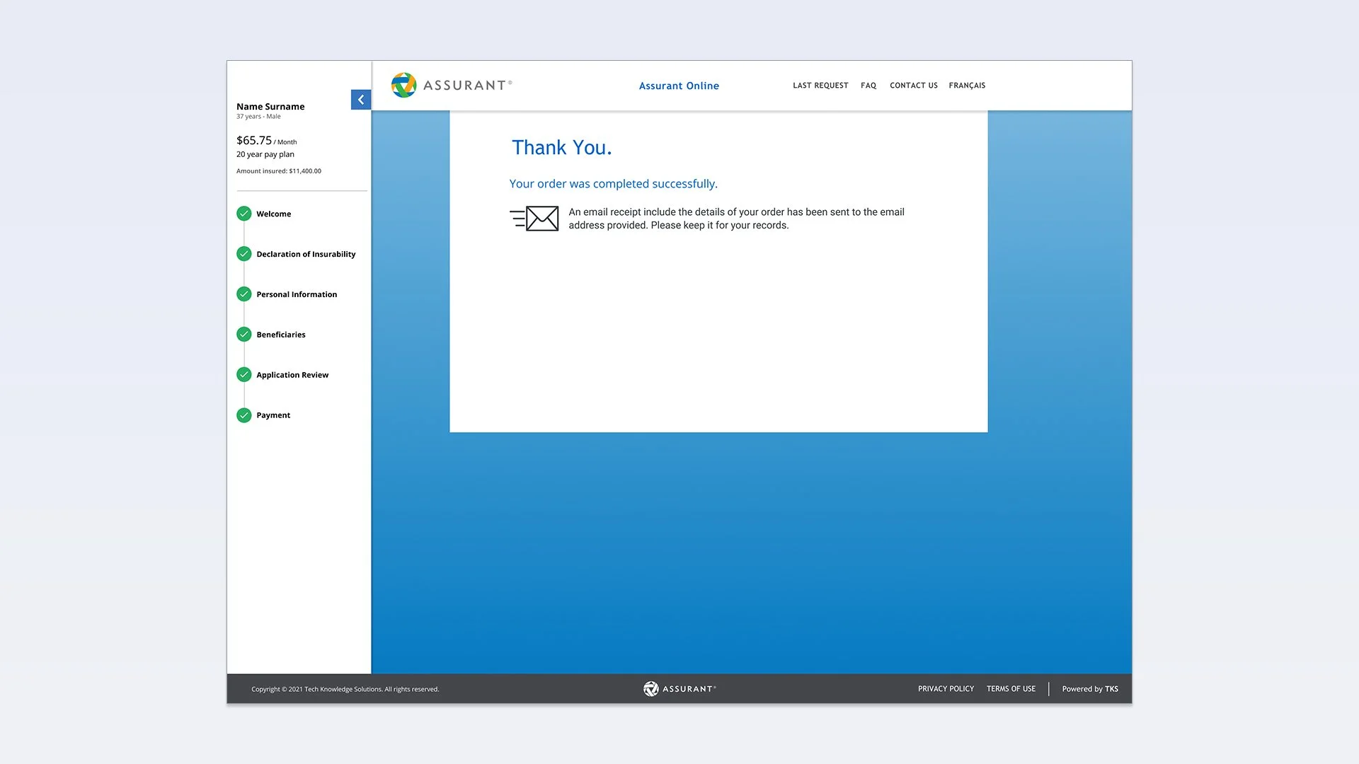
Along with keeping it simple and easy to use for an ageing audience, we wanted to clearly show the steps involved in the checkout process. Feedback revealed that users would not complete the process as it felt too long or were unsure just how many steps were required. Armed with this knowledge, we established a clear timeline panel on the left that would show them how far along they were in the process. We combined multiple questions on a single screen and clearly indicated back & forward buttons incase any details needed to be changed. Before completing payment, the easy-to-read Application Review screen allows the user to review their entered information. Upon payment, the user is brought to a Thank You page containing next steps.
Documentation
Career Takeaways
- Lead product designer
- Taking an existing tool and elevating it in both visual design and user experience
- Incorporating Figma into company ecosystem to deliver high-fidelity designs
- Client pleased with the simpler & easier experience creating a quote
Project Role Summary
- Design high-fidelity wireframes & design systems for dev handoff
- Create working prototypes to test user flows
- Used Agile framework to collaborate daily with software engineers, developers and product managers
